LCE Music

Updates & What's Next:
Overview
LCE Music, led by veteran music industry professional Lyle Chausse, had built a formidable reputation managing and consulting with artists across Canada's music scene.
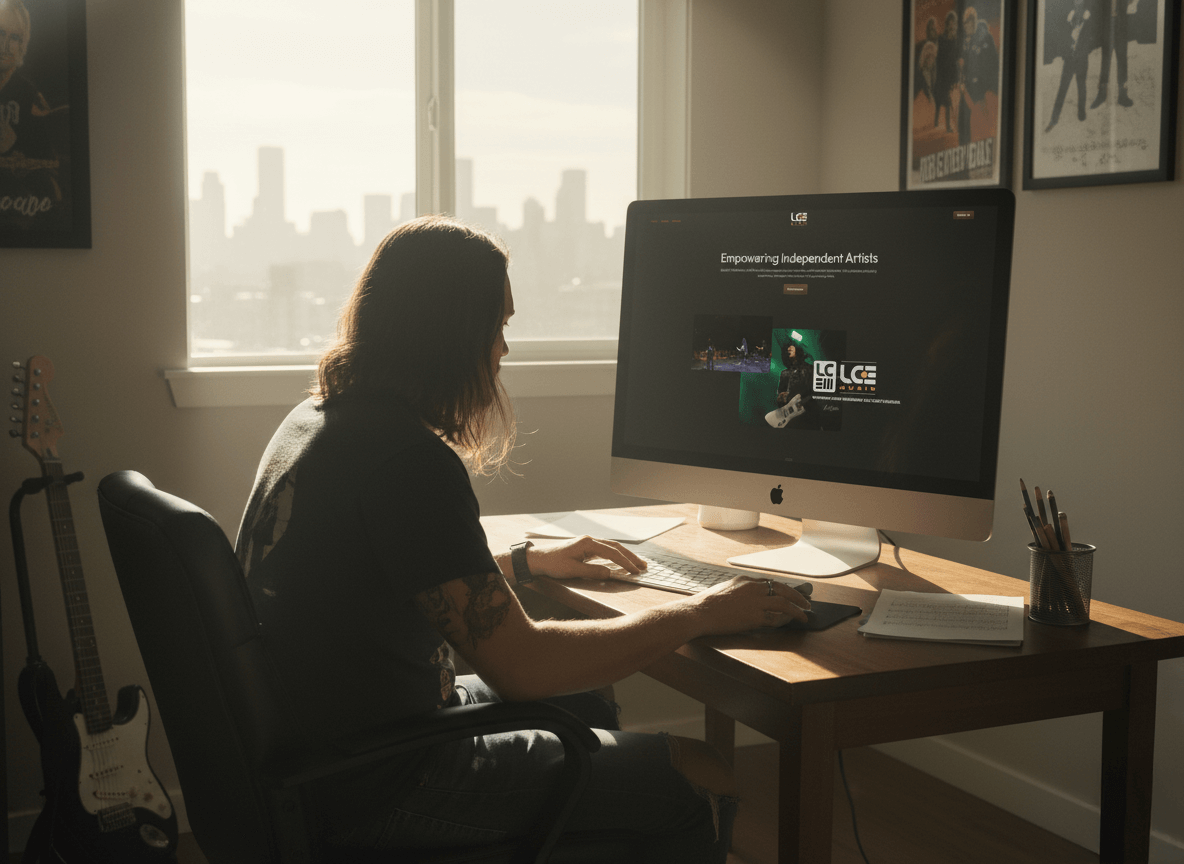
Despite years of industry respect and constant travel between shows, conferences, and consultations, the company existed only through word-of-mouth, a business card, and an email address. With emerging artists as his forte and no digital home base to send prospects to, it was time to translate his credibility into a cohesive brand presence.
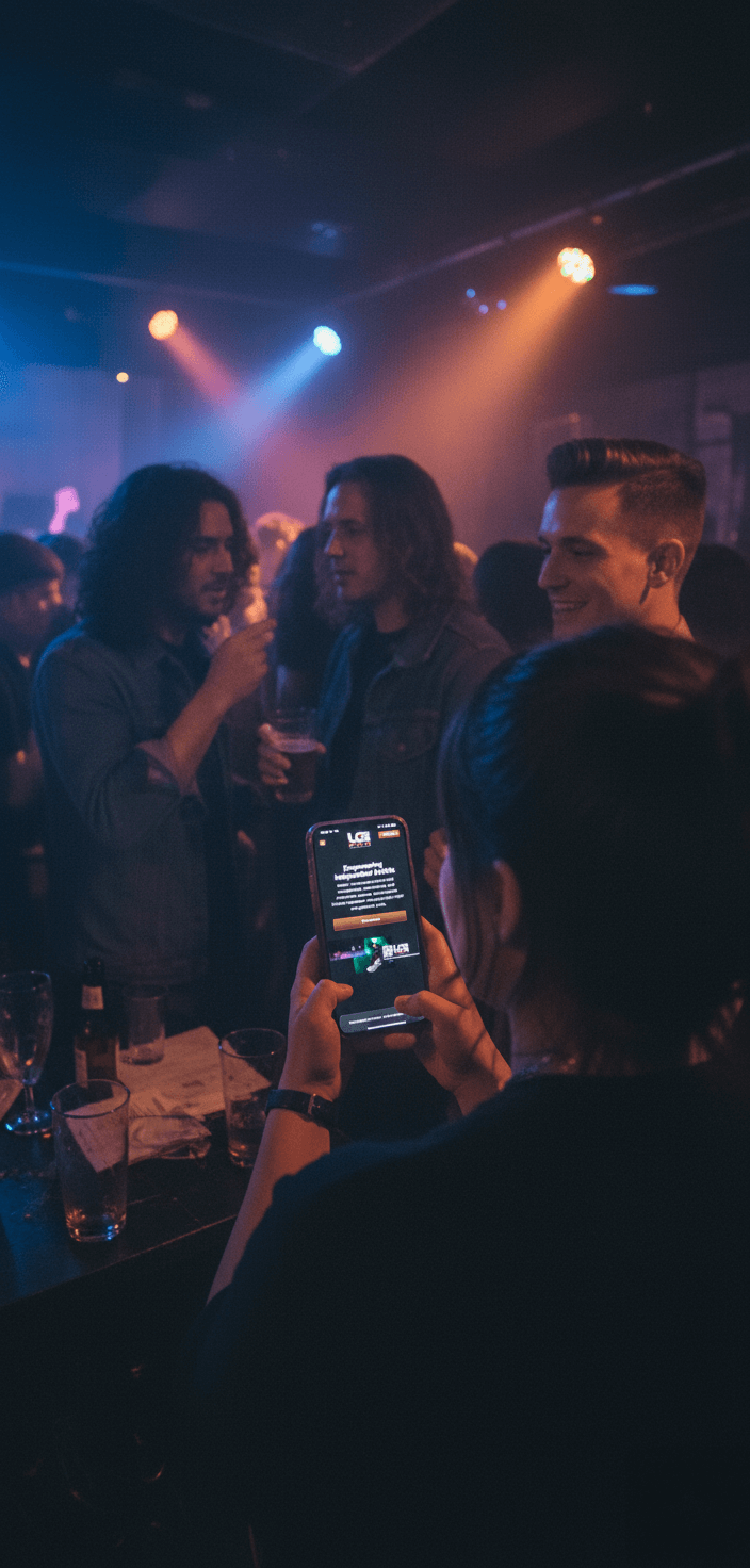
Through a collaborative partnership built on mutual trust, we developed a complete brand identity and web presence that would work as hard as Lyle does, giving him a professional foundation to support both his established reputation and his sister company, Black T-Shirt Company.
Challenges
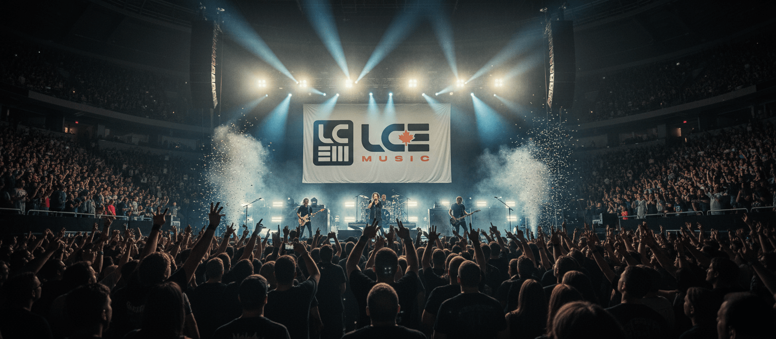
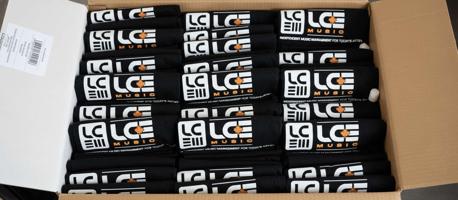
Using a fall-inspired color palette with flat black and off-white supporting the logo, the brand leverages the LCE acronym (Lyle Chausse Entertainment) in a design that pays homage to the classic MAPL logo, the iconic symbol identifying Canadian content and creators. An alternative logo version features a maple leaf cleverly integrated into the negative space between the C and E, reinforcing national pride without being heavy-handed. The complete brand identity system includes logo design, copywriting, and a fully custom website that serves as both a professional portfolio and a central hub for Lyle's constant industry travel. The result is a versatile identity that translates seamlessly across all media while maintaining an authentic rock and roll edge. By strategically connecting LCE Music with the Black T-Shirt Company merchandising services, the website creates a cohesive ecosystem that showcases the full scope of Lyle's industry offerings, giving artists, industry professionals, and potential clients a destination that reflects his expertise and credibility.
Solution
Using a fall-inspired color palette with flat black and off-white supporting the logo, the brand leverages the LCE acronym (Lyle Chausse Entertainment) in a design that pays homage to the classic MAPL logo, the iconic symbol identifying Canadian content and creators. An alternative logo version features a maple leaf cleverly integrated into the negative space between the C and E, reinforcing national pride without being heavy-handed. The result is a versatile identity that translates seamlessly across all media while maintaining an authentic rock and roll edge. The website serves as a professional home base connecting both LCE Music and Black T-Shirt Company, giving artists, industry professionals, and potential clients a destination that reflects Lyle's expertise and credibility.
Results
The rebrand immediately elevated LCE's industry presence. Lyle began receiving more return calls and gained increased recognition, staying top-of-mind with contacts across the music industry. Client feedback has been overwhelmingly positive, with artists expressing genuine pride in being associated with such professional representation. The brand successfully walks the line between rock and roll authenticity and corporate professionalism, it commands respect from festival organizers and record executives while still resonating with independent artists. Most importantly, the website has given Lyle the always-on professional presence his reputation deserves, allowing him to focus on what he does best: championing Canadian music talent.


.png)

Art Szabo is a trusted and excellent brand builder. Website and Graphics are Fantastic. Make sure you contact him for your next Website.
Lyle Chausse
Owner/LCE Music